

Sencha.io Src helps you dynamically resize images for the ever increasing number of mobile screen sizes. We’ve previously done a lot of work in Sencha Touch to make your UI resolution independent, and Src expands this to include your image assets. It’s easy to use, and in this guide, we run through the main API options for the service.
Sencha.io Src is essentially a proxy that lies between image assets (hosted either on your own server or by a third party) and the browser or application requesting them via HTTP. The API is accessed entirely via placing a prefix before the original image URL. This prefix gives you declarative access to all of the different types of transformation that the service can perform. This approach makes the service very easy to add to existing web sites or apps without any programming knowledge.
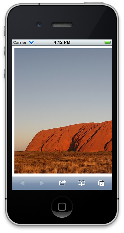
Let’s start with a quick example. Let’s assume you are inserting a 640px × 480px image into your web app or site with markup something like this:
/**
* GeSHi (C) 2004 – 2007 Nigel McNie, 2007 – 2008 Benny Baumann
* (http://qbnz.com/highlighter/ and http://geshi.org/)
*/
.javascript .imp {font-weight: bold; color: red;}
.javascript .kw1 {color: #000066; font-weight: bold;}
.javascript .kw2 {color: #003366; font-weight: bold;}
.javascript .kw3 {color: #000066;}
.javascript .co1 {color: #006600; font-style: italic;}
.javascript .co2 {color: #009966; font-style: italic;}
.javascript .coMULTI {color: #006600; font-style: italic;}
.javascript .es0 {color: #000099; font-weight: bold;}
.javascript .br0 {color: #009900;}
.javascript .sy0 {color: #339933;}
.javascript .st0 {color: #3366CC;}
.javascript .nu0 {color: #CC0000;}
.javascript .me1 {color: #660066;}
.javascript span.xtra { display:block; }
<img
  src='http://sencha.com/files/u.jpg'
  alt='My large image'
/>
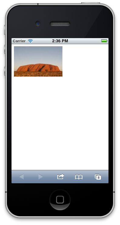
To use Sencha.io Src in its default mode, you simply prefix your absolute src attribute with http://src.sencha.io/
Add that into the tag and your image will be magically resized for a smaller, mobile screen:

/**
* GeSHi (C) 2004 – 2007 Nigel McNie, 2007 – 2008 Benny Baumann
* (http://qbnz.com/highlighter/ and http://geshi.org/)
*/
.javascript .imp {font-weight: bold; color: red;}
.javascript .kw1 {color: #000066; font-weight: bold;}
.javascript .kw2 {color: #003366; font-weight: bold;}
.javascript .kw3 {color: #000066;}
.javascript .co1 {color: #006600; font-style: italic;}
.javascript .co2 {color: #009966; font-style: italic;}
.javascript .coMULTI {color: #006600; font-style: italic;}
.javascript .es0 {color: #000099; font-weight: bold;}
.javascript .br0 {color: #009900;}
.javascript .sy0 {color: #339933;}
.javascript .st0 {color: #3366CC;}
.javascript .nu0 {color: #CC0000;}
.javascript .me1 {color: #660066;}
.javascript span.xtra { display:block; }
<img
  src='http://src.sencha.io/http://sencha.com/files/u.jpg'
  alt='My smaller image'
/>
Unless you tell it otherwise, Sencha.io Src will resize the image to fit the physical screen of the mobile handset visiting your site, based on its user-agent string. For example, if an iPhone 3GS visits the site, the image will be constrained to its screen size of 320px × 480px.
In this particular case, the image is of landscape orientation, and so width becomes the constraining dimension. Aspect ratios are always preserved by Sencha.io Src, so our 640px × 400px image will emerge resized for an iPhone 3GS as 320px × 200px.
If you want to resize graphics to be constrained by something other than the full screen in width or height (and you probably will), there are plenty of other ways the API can be used. Let’s take a look.
Defined sizing
If, instead of keying the size off the user-agent string, you want to resize your images to precise dimensions, Sencha.io Src takes optional parameters to let you define width and height, in that order. These need to appear prior to the image URL in your src attribute. So for example
/**
* GeSHi (C) 2004 – 2007 Nigel McNie, 2007 – 2008 Benny Baumann
* (http://qbnz.com/highlighter/ and http://geshi.org/)
*/
.javascript .imp {font-weight: bold; color: red;}
.javascript .kw1 {color: #000066; font-weight: bold;}
.javascript .kw2 {color: #003366; font-weight: bold;}
.javascript .kw3 {color: #000066;}
.javascript .co1 {color: #006600; font-style: italic;}
.javascript .co2 {color: #009966; font-style: italic;}
.javascript .coMULTI {color: #006600; font-style: italic;}
.javascript .es0 {color: #000099; font-weight: bold;}
.javascript .br0 {color: #009900;}
.javascript .sy0 {color: #339933;}
.javascript .st0 {color: #3366CC;}
.javascript .nu0 {color: #CC0000;}
.javascript .me1 {color: #660066;}
.javascript span.xtra { display:block; }
<img
  src='http://src.sencha.io/320/200/http://sencha.com/files/u.jpg'
  alt='My constrained image'
  width='320'
  height='200'
/>
Because we are being explicit about the resizing, we can also be reasonably confident about using the width and height attributes into the tag as well.
If you are only concerned about constraining the image’s width, just provide a single numeric argument:
/**
* GeSHi (C) 2004 – 2007 Nigel McNie, 2007 – 2008 Benny Baumann
* (http://qbnz.com/highlighter/ and http://geshi.org/)
*/
.javascript .imp {font-weight: bold; color: red;}
.javascript .kw1 {color: #000066; font-weight: bold;}
.javascript .kw2 {color: #003366; font-weight: bold;}
.javascript .kw3 {color: #000066;}
.javascript .co1 {color: #006600; font-style: italic;}
.javascript .co2 {color: #009966; font-style: italic;}
.javascript .coMULTI {color: #006600; font-style: italic;}
.javascript .es0 {color: #000099; font-weight: bold;}
.javascript .br0 {color: #009900;}
.javascript .sy0 {color: #339933;}
.javascript .st0 {color: #3366CC;}
.javascript .nu0 {color: #CC0000;}
.javascript .me1 {color: #660066;}
.javascript span.xtra { display:block; }
<img
  src='http://src.sencha.io/320/http://sencha.com/files/u.jpg'
  alt='My constrained image'
  width='320'
  height='200'
/>
And remember, Sencha.io Src always preserves aspect ratio, so in this example, we can still leave the height attribute of 200px in the tag, even though it is not explicit in the src.
Important note: Sencha.io Src will only shrink images. It will not enlarge them. If you were to specify the following:
/**
* GeSHi (C) 2004 – 2007 Nigel McNie, 2007 – 2008 Benny Baumann
* (http://qbnz.com/highlighter/ and http://geshi.org/)
*/
.javascript .imp {font-weight: bold; color: red;}
.javascript .kw1 {color: #000066; font-weight: bold;}
.javascript .kw2 {color: #003366; font-weight: bold;}
.javascript .kw3 {color: #000066;}
.javascript .co1 {color: #006600; font-style: italic;}
.javascript .co2 {color: #009966; font-style: italic;}
.javascript .coMULTI {color: #006600; font-style: italic;}
.javascript .es0 {color: #000099; font-weight: bold;}
.javascript .br0 {color: #009900;}
.javascript .sy0 {color: #339933;}
.javascript .st0 {color: #3366CC;}
.javascript .nu0 {color: #CC0000;}
.javascript .me1 {color: #660066;}
.javascript span.xtra { display:block; }
<img
  src='http://src.sencha.io/1280/http://sencha.com/files/u.jpg'
  alt='My huge image'
  width='1280'
  height='800'
/>
…then the returned image would be the same as the original. This means that you should make sure the original graphics are large enough to fulfill your needs, especially for high-resolution smart-phone devices.
Client-side measurements
This is currently an experimental feature. Sencha.io Src provides a small JavaScript file which obtains the browser’s screen dimensions and places them in a cookie scoped to the src.sencha.io domain. Subsequent requests to Sencha.io Src to have an image resized can then refer to these dimensions rather than explicit values.
To insert the JavaScript into an HTML page, use the following snippet:
/**
* GeSHi (C) 2004 – 2007 Nigel McNie, 2007 – 2008 Benny Baumann
* (http://qbnz.com/highlighter/ and http://geshi.org/)
*/
.javascript .imp {font-weight: bold; color: red;}
.javascript .kw1 {color: #000066; font-weight: bold;}
.javascript .kw2 {color: #003366; font-weight: bold;}
.javascript .kw3 {color: #000066;}
.javascript .co1 {color: #006600; font-style: italic;}
.javascript .co2 {color: #009966; font-style: italic;}
.javascript .coMULTI {color: #006600; font-style: italic;}
.javascript .es0 {color: #000099; font-weight: bold;}
.javascript .br0 {color: #009900;}
.javascript .sy0 {color: #339933;}
.javascript .st0 {color: #3366CC;}
.javascript .nu0 {color: #CC0000;}
.javascript .me1 {color: #660066;}
.javascript span.xtra { display:block; }
<script src='http://src.sencha.io/screen.js'></script>
Where you place this can matter. If you place it at the start of the document, it’s slightly more likely that the cookie has been set before the images within the page are downloaded – increasing the chance that your newly-measured dimensions can be used within this load of the page itself. By placing the script after the closing </body>, however, increases the chance that the page has laid itself out, and this can sometimes affect some of the measurements made.
To constrain an image to the width of the device returned by the screen.width measurement, insert it where you would have placed an explicit value:
/**
* GeSHi (C) 2004 – 2007 Nigel McNie, 2007 – 2008 Benny Baumann
* (http://qbnz.com/highlighter/ and http://geshi.org/)
*/
.javascript .imp {font-weight: bold; color: red;}
.javascript .kw1 {color: #000066; font-weight: bold;}
.javascript .kw2 {color: #003366; font-weight: bold;}
.javascript .kw3 {color: #000066;}
.javascript .co1 {color: #006600; font-style: italic;}
.javascript .co2 {color: #009966; font-style: italic;}
.javascript .coMULTI {color: #006600; font-style: italic;}
.javascript .es0 {color: #000099; font-weight: bold;}
.javascript .br0 {color: #009900;}
.javascript .sy0 {color: #339933;}
.javascript .st0 {color: #3366CC;}
.javascript .nu0 {color: #CC0000;}
.javascript .me1 {color: #660066;}
.javascript span.xtra { display:block; }
<script src='http://src.sencha.io/screen.js'></script>
<img
  src='http://src.sencha.io/screen.width/http://sencha.com/files/u.jpg'
  alt='My JS-measured image'
/>
You can also abbreviate the measurement names for brevity:
/**
* GeSHi (C) 2004 – 2007 Nigel McNie, 2007 – 2008 Benny Baumann
* (http://qbnz.com/highlighter/ and http://geshi.org/)
*/
.javascript .imp {font-weight: bold; color: red;}
.javascript .kw1 {color: #000066; font-weight: bold;}
.javascript .kw2 {color: #003366; font-weight: bold;}
.javascript .kw3 {color: #000066;}
.javascript .co1 {color: #006600; font-style: italic;}
.javascript .co2 {color: #009966; font-style: italic;}
.javascript .coMULTI {color: #006600; font-style: italic;}
.javascript .es0 {color: #000099; font-weight: bold;}
.javascript .br0 {color: #009900;}
.javascript .sy0 {color: #339933;}
.javascript .st0 {color: #3366CC;}
.javascript .nu0 {color: #CC0000;}
.javascript .me1 {color: #660066;}
.javascript span.xtra { display:block; }
<script src='http://src.sencha.io/screen.js'></script>
<img
  src='http://src.sencha.io/sw/http://sencha.com/files/u.jpg'
  alt='My JS-measured image'
/>
The full set of client measurements available, with abbreviations, is in the API summary at the end of this document
For example, if you wanted to include an image that was constrained by ‘available’ height and width measurements, you could use the following:
/**
* GeSHi (C) 2004 – 2007 Nigel McNie, 2007 – 2008 Benny Baumann
* (http://qbnz.com/highlighter/ and http://geshi.org/)
*/
.javascript .imp {font-weight: bold; color: red;}
.javascript .kw1 {color: #000066; font-weight: bold;}
.javascript .kw2 {color: #003366; font-weight: bold;}
.javascript .kw3 {color: #000066;}
.javascript .co1 {color: #006600; font-style: italic;}
.javascript .co2 {color: #009966; font-style: italic;}
.javascript .coMULTI {color: #006600; font-style: italic;}
.javascript .es0 {color: #000099; font-weight: bold;}
.javascript .br0 {color: #009900;}
.javascript .sy0 {color: #339933;}
.javascript .st0 {color: #3366CC;}
.javascript .nu0 {color: #CC0000;}
.javascript .me1 {color: #660066;}
.javascript span.xtra { display:block; }
<script src='http://src.sencha.io/screen.js'></script>
<img
  src='http://src.sencha.io/saw/sah/http://sencha.com/files/u.jpg'
  alt='My JS-measured image'
/>
Note: The document.body.* properties are particularly affected by where you place the script snippet, although under certain conditions, window.outerHeight will also vary on mobile browsers during page load. Also note that the values returned from many of these properties will depend upon the DOCTYPE of the document and any viewport scale setting. Real-device testing is highly recommended when using this experimental technique.
Orientation
You may explicitly indicate the orientation of image constraints, by placing landscape or portrait in the URL, which will flip the width and height constraints if required. (Note that this will only have effect if the screen dimensions have been identified from the device’s user-agent: if you have explicitly specified a width and height, the flip will not occur.)
On an iPhone, for example, the following code will constrain an image to be 480px wide (and 320px high), instead of the normal 320 pixels wide (and 480px high):
/**
* GeSHi (C) 2004 – 2007 Nigel McNie, 2007 – 2008 Benny Baumann
* (http://qbnz.com/highlighter/ and http://geshi.org/)
*/
.javascript .imp {font-weight: bold; color: red;}
.javascript .kw1 {color: #000066; font-weight: bold;}
.javascript .kw2 {color: #003366; font-weight: bold;}
.javascript .kw3 {color: #000066;}
.javascript .co1 {color: #006600; font-style: italic;}
.javascript .co2 {color: #009966; font-style: italic;}
.javascript .coMULTI {color: #006600; font-style: italic;}
.javascript .es0 {color: #000099; font-weight: bold;}
.javascript .br0 {color: #009900;}
.javascript .sy0 {color: #339933;}
.javascript .st0 {color: #3366CC;}
.javascript .nu0 {color: #CC0000;}
.javascript .me1 {color: #660066;}
.javascript span.xtra { display:block; }
<img
  src='http://src.sencha.io/landscape/http://sencha.com/files/u.jpg'
  alt='Constrained to WxH, W greater than H'
/>
As a further experimental feature, client-side measurement can be attempted to detect the current orientation of a device, using the window.orientation API. Specify detect for the orientation to try to use the value that may have been recently sent by the screen.js cookie:
/**
* GeSHi (C) 2004 – 2007 Nigel McNie, 2007 – 2008 Benny Baumann
* (http://qbnz.com/highlighter/ and http://geshi.org/)
*/
.javascript .imp {font-weight: bold; color: red;}
.javascript .kw1 {color: #000066; font-weight: bold;}
.javascript .kw2 {color: #003366; font-weight: bold;}
.javascript .kw3 {color: #000066;}
.javascript .co1 {color: #006600; font-style: italic;}
.javascript .co2 {color: #009966; font-style: italic;}
.javascript .coMULTI {color: #006600; font-style: italic;}
.javascript .es0 {color: #000099; font-weight: bold;}
.javascript .br0 {color: #009900;}
.javascript .sy0 {color: #339933;}
.javascript .st0 {color: #3366CC;}
.javascript .nu0 {color: #CC0000;}
.javascript .me1 {color: #660066;}
.javascript span.xtra { display:block; }
<script src='http://src.sencha.io/screen.js'></script>
<img
  src='http://src.sencha.io/detect/http://sencha.com/files/u.jpg'
  alt='Constrained according to orientation'
/>
Remember again that there is a very likely race condition whereby the cookie’s value may not be set before the image starts to download, and so the immediate effect may not be apparent in the first rendering of the page.
The test page for this experimental feature uses DOM manipulation on the document’s load event to ensure the cookie is set, before inserting the resized element. Try it on a modern mobile device: rotate the device and reload the page to see the feature in action.
Altering sizes
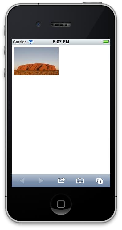
As we have seen, an explicit width or height before the URL will fix the image size. Sometimes, however, you want these dimensions to be based on physical screen size, but then altered slightly. For example you might notice in our example above that the 8 pixel white margin around the web page means that the 320-pixel-wide image actually truncates on the right hand side of the iPhone screen.
Instead of using absolute values, we can alter width and height parameters by prefixing operands with characters like -, a or x. Under these conditions, the numbers would represent subtraction, addition and percentage scaling of the dynamic screen size, respectively.
So for example, if you wanted your image to be, at most, 16 pixels narrower than the width of the screen, (whatever that actually is), you would use -16, as in the following:

/**
* GeSHi (C) 2004 – 2007 Nigel McNie, 2007 – 2008 Benny Baumann
* (http://qbnz.com/highlighter/ and http://geshi.org/)
*/
.javascript .imp {font-weight: bold; color: red;}
.javascript .kw1 {color: #000066; font-weight: bold;}
.javascript .kw2 {color: #003366; font-weight: bold;}
.javascript .kw3 {color: #000066;}
.javascript .co1 {color: #006600; font-style: italic;}
.javascript .co2 {color: #009966; font-style: italic;}
.javascript .coMULTI {color: #006600; font-style: italic;}
.javascript .es0 {color: #000099; font-weight: bold;}
.javascript .br0 {color: #009900;}
.javascript .sy0 {color: #339933;}
.javascript .st0 {color: #3366CC;}
.javascript .nu0 {color: #CC0000;}
.javascript .me1 {color: #660066;}
.javascript span.xtra { display:block; }
<img
  src='http://src.sencha.io/-16/http://sencha.com/files/u.jpg'
  alt='My image, constrained to 16px less than the screen'
/>
This is useful if you wish to leave a border around your images or if you want to account for the scroll bar of the browser screen. On the iPhone example to the side, you should be able to see it now accounts for the default document margin effect.
Percentage sizing
Similarly, if you want to scale the graphic to a proportion of the screen, use the x prefix. The value provided is interpreted as an integer percentage from 1 to 100.
So to ensure the image takes no more than half the screen, use x50, as in the following:
/**
* GeSHi (C) 2004 – 2007 Nigel McNie, 2007 – 2008 Benny Baumann
* (http://qbnz.com/highlighter/ and http://geshi.org/)
*/
.javascript .imp {font-weight: bold; color: red;}
.javascript .kw1 {color: #000066; font-weight: bold;}
.javascript .kw2 {color: #003366; font-weight: bold;}
.javascript .kw3 {color: #000066;}
.javascript .co1 {color: #006600; font-style: italic;}
.javascript .co2 {color: #009966; font-style: italic;}
.javascript .coMULTI {color: #006600; font-style: italic;}
.javascript .es0 {color: #000099; font-weight: bold;}
.javascript .br0 {color: #009900;}
.javascript .sy0 {color: #339933;}
.javascript .st0 {color: #3366CC;}
.javascript .nu0 {color: #CC0000;}
.javascript .me1 {color: #660066;}
.javascript span.xtra { display:block; }
<img
  src='http://src.sencha.io/x50/http://sencha.com/files/u.jpg'
  alt='My image, constrained by half the width of the screen'
/>
It is possible to use either of these modifiers on both the width and the height simultaneously.
For example, the following would ensure the image fitted into a quadrant of the screen (although in this case it has no effect):
/**
* GeSHi (C) 2004 – 2007 Nigel McNie, 2007 – 2008 Benny Baumann
* (http://qbnz.com/highlighter/ and http://geshi.org/)
*/
.javascript .imp {font-weight: bold; color: red;}
.javascript .kw1 {color: #000066; font-weight: bold;}
.javascript .kw2 {color: #003366; font-weight: bold;}
.javascript .kw3 {color: #000066;}
.javascript .co1 {color: #006600; font-style: italic;}
.javascript .co2 {color: #009966; font-style: italic;}
.javascript .coMULTI {color: #006600; font-style: italic;}
.javascript .es0 {color: #000099; font-weight: bold;}
.javascript .br0 {color: #009900;}
.javascript .sy0 {color: #339933;}
.javascript .st0 {color: #3366CC;}
.javascript .nu0 {color: #CC0000;}
.javascript .me1 {color: #660066;}
.javascript span.xtra { display:block; }
<img
  src='http://src.sencha.io/x50/x50/http://sencha.com/files/u.jpg'
  alt='My image, at most half width, half height'
/>
Different modifiers can be used for width and height. This example ensures the image will never run the width of the screen, but also that it doesn’t take up more than 15% of its vertical height. This obviously suits wide, landscape images best, such as banner ads, for example.

/**
* GeSHi (C) 2004 – 2007 Nigel McNie, 2007 – 2008 Benny Baumann
* (http://qbnz.com/highlighter/ and http://geshi.org/)
*/
.javascript .imp {font-weight: bold; color: red;}
.javascript .kw1 {color: #000066; font-weight: bold;}
.javascript .kw2 {color: #003366; font-weight: bold;}
.javascript .kw3 {color: #000066;}
.javascript .co1 {color: #006600; font-style: italic;}
.javascript .co2 {color: #009966; font-style: italic;}
.javascript .coMULTI {color: #006600; font-style: italic;}
.javascript .es0 {color: #000099; font-weight: bold;}
.javascript .br0 {color: #009900;}
.javascript .sy0 {color: #339933;}
.javascript .st0 {color: #3366CC;}
.javascript .nu0 {color: #CC0000;}
.javascript .me1 {color: #660066;}
.javascript span.xtra { display:block; }
<img
  src='http://src.sencha.io/-16/x15/http://sencha.com/files/u.jpg'
  alt='My image, constrained in banner-ad style'
/>
Other adjustments
For completeness, the addition operator allows you to increase the image size. a20 will expand the constraints of the image by 20 pixels, for example. Remember, Sencha.io Src will never grow an image beyond its original size – but it might occasionally be useful if you have knowingly reduced an image’s size and then want to grow it slightly.
There is a rounding-down operator, r, which will round a size down to the nearest multiple of that value. This might be useful if you have a tile- or column-based layout. The following will round down the constraint to ensure that the half-width image’s width is always a multiple of 20 pixels:
/**
* GeSHi (C) 2004 – 2007 Nigel McNie, 2007 – 2008 Benny Baumann
* (http://qbnz.com/highlighter/ and http://geshi.org/)
*/
.javascript .imp {font-weight: bold; color: red;}
.javascript .kw1 {color: #000066; font-weight: bold;}
.javascript .kw2 {color: #003366; font-weight: bold;}
.javascript .kw3 {color: #000066;}
.javascript .co1 {color: #006600; font-style: italic;}
.javascript .co2 {color: #009966; font-style: italic;}
.javascript .coMULTI {color: #006600; font-style: italic;}
.javascript .es0 {color: #000099; font-weight: bold;}
.javascript .br0 {color: #009900;}
.javascript .sy0 {color: #339933;}
.javascript .st0 {color: #3366CC;}
.javascript .nu0 {color: #CC0000;}
.javascript .me1 {color: #660066;}
.javascript span.xtra { display:block; }
<img
  src='http://src.sencha.io/x50r20/http://sencha.com/files/u.jpg'
  alt='Half the screen, rounded down to nearest 20 pixels'
/>
Finally, you can specify a maximum value for the image’s size, so that you can be sure that, regardless of any other transformations, it does not exceed a limit. You can specify two maxima, to depend upon whether the browser has been identified as being mobile or non-mobile. For mobile browsers, the m operator is obeyed, and for desktop browsers, the n operator is used.
The code below will display an image no larger than 500 pixels on a desktop browser, and no larger than 100 pixels on a mobile browser:
/**
* GeSHi (C) 2004 – 2007 Nigel McNie, 2007 – 2008 Benny Baumann
* (http://qbnz.com/highlighter/ and http://geshi.org/)
*/
.javascript .imp {font-weight: bold; color: red;}
.javascript .kw1 {color: #000066; font-weight: bold;}
.javascript .kw2 {color: #003366; font-weight: bold;}
.javascript .kw3 {color: #000066;}
.javascript .co1 {color: #006600; font-style: italic;}
.javascript .co2 {color: #009966; font-style: italic;}
.javascript .coMULTI {color: #006600; font-style: italic;}
.javascript .es0 {color: #000099; font-weight: bold;}
.javascript .br0 {color: #009900;}
.javascript .sy0 {color: #339933;}
.javascript .st0 {color: #3366CC;}
.javascript .nu0 {color: #CC0000;}
.javascript .me1 {color: #660066;}
.javascript span.xtra { display:block; }
<img
  src='http://src.sencha.io/n500m100/http://sencha.com/files/u.jpg'
  alt='Max 500 or 100, depending on browser'
/>
Complex formulaic operations
You can string together all of these formulaic operations. If you wanted to have two images side-by-side, with balanced margins, we can combine the -16 from the example above with x50 to halve the width.
The following approach might work well for a gallery app, for example:

/**
* GeSHi (C) 2004 – 2007 Nigel McNie, 2007 – 2008 Benny Baumann
* (http://qbnz.com/highlighter/ and http://geshi.org/)
*/
.javascript .imp {font-weight: bold; color: red;}
.javascript .kw1 {color: #000066; font-weight: bold;}
.javascript .kw2 {color: #003366; font-weight: bold;}
.javascript .kw3 {color: #000066;}
.javascript .co1 {color: #006600; font-style: italic;}
.javascript .co2 {color: #009966; font-style: italic;}
.javascript .coMULTI {color: #006600; font-style: italic;}
.javascript .es0 {color: #000099; font-weight: bold;}
.javascript .br0 {color: #009900;}
.javascript .sy0 {color: #339933;}
.javascript .st0 {color: #3366CC;}
.javascript .nu0 {color: #CC0000;}
.javascript .me1 {color: #660066;}
.javascript span.xtra { display:block; }
<img
  src='http://src.sencha.io/-16x50-2/http://sencha.com/files/u.jpg'
  alt='My image, in a gallery'
/>
<img
  src='http://src.sencha.io/-16x50-2/http://sencha.com/files/u.jpg'
  alt='Another image, in a gallery'
/>
(Note we also deduct a further 2 pixels to account for the 4 pixel gap caused by whitespace between the <img> tags in the markup.)
And finally, if the width (or height) does not start with -, a or x modifiers, it is interpreted as an absolute pixel number upon which further operations can be applied. In other words, it is possible to specify 320-8 to get the same effect as using 312 explicitly.
This is particularly useful when you use the (experimental) client-side measurement technique, allowing you to deduct values from those measurements. This will use a client-side measurement of screen.width and then deduct 16 pixels:
/**
* GeSHi (C) 2004 – 2007 Nigel McNie, 2007 – 2008 Benny Baumann
* (http://qbnz.com/highlighter/ and http://geshi.org/)
*/
.javascript .imp {font-weight: bold; color: red;}
.javascript .kw1 {color: #000066; font-weight: bold;}
.javascript .kw2 {color: #003366; font-weight: bold;}
.javascript .kw3 {color: #000066;}
.javascript .co1 {color: #006600; font-style: italic;}
.javascript .co2 {color: #009966; font-style: italic;}
.javascript .coMULTI {color: #006600; font-style: italic;}
.javascript .es0 {color: #000099; font-weight: bold;}
.javascript .br0 {color: #009900;}
.javascript .sy0 {color: #339933;}
.javascript .st0 {color: #3366CC;}
.javascript .nu0 {color: #CC0000;}
.javascript .me1 {color: #660066;}
.javascript span.xtra { display:block; }
<img
  src='http://src.sencha.io/sw-16/http://sencha.com/files/u.jpg'
  alt='Client-measurement, reduced'
/>
You can use different techniques in different dimensions of course. This example constrains the image by half the width of the screen and exactly 90 pixels in height. This technique might be useful if you want your gallery to handle both landscape and portrait images alongside each other.
/**
* GeSHi (C) 2004 – 2007 Nigel McNie, 2007 – 2008 Benny Baumann
* (http://qbnz.com/highlighter/ and http://geshi.org/)
*/
.javascript .imp {font-weight: bold; color: red;}
.javascript .kw1 {color: #000066; font-weight: bold;}
.javascript .kw2 {color: #003366; font-weight: bold;}
.javascript .kw3 {color: #000066;}
.javascript .co1 {color: #006600; font-style: italic;}
.javascript .co2 {color: #009966; font-style: italic;}
.javascript .coMULTI {color: #006600; font-style: italic;}
.javascript .es0 {color: #000099; font-weight: bold;}
.javascript .br0 {color: #009900;}
.javascript .sy0 {color: #339933;}
.javascript .st0 {color: #3366CC;}
.javascript .nu0 {color: #CC0000;}
.javascript .me1 {color: #660066;}
.javascript span.xtra { display:block; }
<img
  src='http://src.sencha.io/-16x50/90/http://sencha.com/files/u.jpg'
  alt='My half-width image, not too tall'
/>
It is important to remember that in all these cases, however, the image retains its aspect ratio. Even if the resulting dimensions of the above examples are letterbox in shape, a portrait image will remain portrait.
File formats
You can specify the file format of the resulting image that’s returned from Sencha.io Src. You can choose either PNG or JPG encoding by using the png or jpg token. This parameter goes before the dimensions (if present) in the URL. In the following example, an original JPG is converted to both default, and explicitly resized, PNG images:

/**
* GeSHi (C) 2004 – 2007 Nigel McNie, 2007 – 2008 Benny Baumann
* (http://qbnz.com/highlighter/ and http://geshi.org/)
*/
.javascript .imp {font-weight: bold; color: red;}
.javascript .kw1 {color: #000066; font-weight: bold;}
.javascript .kw2 {color: #003366; font-weight: bold;}
.javascript .kw3 {color: #000066;}
.javascript .co1 {color: #006600; font-style: italic;}
.javascript .co2 {color: #009966; font-style: italic;}
.javascript .coMULTI {color: #006600; font-style: italic;}
.javascript .es0 {color: #000099; font-weight: bold;}
.javascript .br0 {color: #009900;}
.javascript .sy0 {color: #339933;}
.javascript .st0 {color: #3366CC;}
.javascript .nu0 {color: #CC0000;}
.javascript .me1 {color: #660066;}
.javascript span.xtra { display:block; }
<img
  src='http://src.sencha.io/png/http://sencha.com/files/u.jpg'
  alt='My PNG'
/>
<img
  src='http://src.sencha.io/png/-16x50/http://sencha.com/files/u.jpg'
  alt='My small PNG'
/>
If not specified, Sencha.io Src will decide on a suitable format based on the original image. PNGs and JPGs will remain in their original format, and GIF images will get converted to PNG. Sencha.io Src will never emit a GIF.
Note that JPG is a ‘lossy’ encoding, so the quality of a resized JPG image will not necessarily be as good as the original PNG (although it should be smaller in file size). You can also take control of the degree to which the JPG is compressed, by appending a number between 1 and 100 to the end of the jpg formatting token, like this:

/**
* GeSHi (C) 2004 – 2007 Nigel McNie, 2007 – 2008 Benny Baumann
* (http://qbnz.com/highlighter/ and http://geshi.org/)
*/
.javascript .imp {font-weight: bold; color: red;}
.javascript .kw1 {color: #000066; font-weight: bold;}
.javascript .kw2 {color: #003366; font-weight: bold;}
.javascript .kw3 {color: #000066;}
.javascript .co1 {color: #006600; font-style: italic;}
.javascript .co2 {color: #009966; font-style: italic;}
.javascript .coMULTI {color: #006600; font-style: italic;}
.javascript .es0 {color: #000099; font-weight: bold;}
.javascript .br0 {color: #009900;}
.javascript .sy0 {color: #339933;}
.javascript .st0 {color: #3366CC;}
.javascript .nu0 {color: #CC0000;}
.javascript .me1 {color: #660066;}
.javascript span.xtra { display:block; }
<img
  src='http://src.sencha.io/jpg/-16/http://sencha.com/files/u.jpg'
  alt='My JPG'
/>
<img
  src='http://src.sencha.io/jpg2/-16/http://sencha.com/files/u.jpg'
  alt='My highly compressed JPG'
/>
It’s important to note that the compression will only change if the dimensions of the image have changed or if the original format was PNG and has been converted to JPG. If you have a small JPG image, smaller than the constraints you’ve specified for it, it will always remain with its original compression.
Also note that PNG images will lose their the alpha channel when converted to JPG, so you are advised to keep any PNG files with transparent regions in that format. Resizing PNG files while remaining in the same format, however, will preserve the alpha channel.
Data URLs
In some circumstances, you might want to return your image in an encoded format. In particular, images can be encoded into data URLs.
This is useful if you want to embed an image into the markup or stylesheet of a site or application, or if you want to cache an image resource offline in a textual form in a browser’s local storage. Unlike performing the toDataURL method of a <canvas> element, using Sencha.io Src allows you to encode images from other origin servers.
To have Sencha.io Src return the requested image in data URL format, simply place ‘data’ as the first segment of the request:
/**
* GeSHi (C) 2004 – 2007 Nigel McNie, 2007 – 2008 Benny Baumann
* (http://qbnz.com/highlighter/ and http://geshi.org/)
*/
.text .imp {font-weight: bold; color: red;}
.text span.xtra { display:block; }
http://src.sencha.io/data/http://sencha.com/files/u.jpg
This returns, as a plain text response:
/**
* GeSHi (C) 2004 – 2007 Nigel McNie, 2007 – 2008 Benny Baumann
* (http://qbnz.com/highlighter/ and http://geshi.org/)
*/
.text .imp {font-weight: bold; color: red;}
.text span.xtra { display:block; }
data:image/jpeg;base64,/9j/4AAQSkZJRgABAQ...
You can use this on your server, or perhaps in a build environment, to create such URLs. But to be honest, you are more likely to prefer to use local base-64 encoding tools in those contexts. And in a browser environment, it is quite likely that this is also of little use, since browsers may not be able to make AJAX requests to src.sencha.io, a different origin server.
So the real power of this API comes from being able to use it in a JSON-P form. This allows you to specify the name of a local callback function, which, if present, will mean that Sencha.io Src returns a fragment of JavaScript that you can include in your document, and which calls that function.
The callback function is provided as a dotted-suffix to the ‘data’ segment. For example:
/**
* GeSHi (C) 2004 – 2007 Nigel McNie, 2007 – 2008 Benny Baumann
* (http://qbnz.com/highlighter/ and http://geshi.org/)
*/
.text .imp {font-weight: bold; color: red;}
.text span.xtra { display:block; }
http://src.sencha.io/data.myCallBack/http://sencha.com/files/u.jpg
This will return, as a JavaScript response:
/**
* GeSHi (C) 2004 – 2007 Nigel McNie, 2007 – 2008 Benny Baumann
* (http://qbnz.com/highlighter/ and http://geshi.org/)
*/
.javascript .imp {font-weight: bold; color: red;}
.javascript .kw1 {color: #000066; font-weight: bold;}
.javascript .kw2 {color: #003366; font-weight: bold;}
.javascript .kw3 {color: #000066;}
.javascript .co1 {color: #006600; font-style: italic;}
.javascript .co2 {color: #009966; font-style: italic;}
.javascript .coMULTI {color: #006600; font-style: italic;}
.javascript .es0 {color: #000099; font-weight: bold;}
.javascript .br0 {color: #009900;}
.javascript .sy0 {color: #339933;}
.javascript .st0 {color: #3366CC;}
.javascript .nu0 {color: #CC0000;}
.javascript .me1 {color: #660066;}
.javascript span.xtra { display:block; }
myCallBack('data:image/jpeg;base64,/9j/4AAQSkZJRgABAQ...');
This now means that you can do something programmatically with the string – in the browser – such as set it as the source of an <img> element or cache it to the browser’s local storage.
Because it’s possible you might want to run this callback multiple times with some sort of identifier to attach it to different <img> elements throughout the document, the callback allows you to add additional initial arguments. If your callback name contains hyphens (-), these are used as separators, and subsequent portions get treated as successive string arguments. (Also, the callback name itself can contain dotted syntax so you can invoke a method within an object or a function within a specific namespace).
So, for example:
/**
* GeSHi (C) 2004 – 2007 Nigel McNie, 2007 – 2008 Benny Baumann
* (http://qbnz.com/highlighter/ and http://geshi.org/)
*/
.text .imp {font-weight: bold; color: red;}
.text span.xtra { display:block; }
http://src.sencha.io/data.MyApp.myCallBack-img2/http://sencha.com/files/u.jpg
This will return, as a JavaScript response:
/**
* GeSHi (C) 2004 – 2007 Nigel McNie, 2007 – 2008 Benny Baumann
* (http://qbnz.com/highlighter/ and http://geshi.org/)
*/
.javascript .imp {font-weight: bold; color: red;}
.javascript .kw1 {color: #000066; font-weight: bold;}
.javascript .kw2 {color: #003366; font-weight: bold;}
.javascript .kw3 {color: #000066;}
.javascript .co1 {color: #006600; font-style: italic;}
.javascript .co2 {color: #009966; font-style: italic;}
.javascript .coMULTI {color: #006600; font-style: italic;}
.javascript .es0 {color: #000099; font-weight: bold;}
.javascript .br0 {color: #009900;}
.javascript .sy0 {color: #339933;}
.javascript .st0 {color: #3366CC;}
.javascript .nu0 {color: #CC0000;}
.javascript .me1 {color: #660066;}
.javascript span.xtra { display:block; }
MyApp.myCallBack('img2','data:image/jpeg;base64,/9j/4AAQSkZJRgABAQ...');
Typically, your callback would use that first argument as a way to reference an image within the document. This callback will be run asynchronously to the original JSON-P mechanism and scope, so otherwise you’d have no way to correlate responses with target elements.
Note that if you need to use hyphens in your arguments, you can use commas (,), the presence of which means that that will be used as the separator instead of hyphens. For example:
/**
* GeSHi (C) 2004 – 2007 Nigel McNie, 2007 – 2008 Benny Baumann
* (http://qbnz.com/highlighter/ and http://geshi.org/)
*/
.text .imp {font-weight: bold; color: red;}
.text span.xtra { display:block; }
http://src.sencha.io/data.MyApp.myCallBack,img-2,123/http://sencha.com/files/u.jpg
This will return:
/**
* GeSHi (C) 2004 – 2007 Nigel McNie, 2007 – 2008 Benny Baumann
* (http://qbnz.com/highlighter/ and http://geshi.org/)
*/
.javascript .imp {font-weight: bold; color: red;}
.javascript .kw1 {color: #000066; font-weight: bold;}
.javascript .kw2 {color: #003366; font-weight: bold;}
.javascript .kw3 {color: #000066;}
.javascript .co1 {color: #006600; font-style: italic;}
.javascript .co2 {color: #009966; font-style: italic;}
.javascript .coMULTI {color: #006600; font-style: italic;}
.javascript .es0 {color: #000099; font-weight: bold;}
.javascript .br0 {color: #009900;}
.javascript .sy0 {color: #339933;}
.javascript .st0 {color: #3366CC;}
.javascript .nu0 {color: #CC0000;}
.javascript .me1 {color: #660066;}
.javascript span.xtra { display:block; }
MyApp.myCallBack('img-2','123','data:image/jpeg;base64,/9j/4AAQSkZJRgABAQ...');
The following is a full, working example, which replaces an hourglass image with the data URL for a tick:
/**
* GeSHi (C) 2004 – 2007 Nigel McNie, 2007 – 2008 Benny Baumann
* (http://qbnz.com/highlighter/ and http://geshi.org/)
*/
.javascript .imp {font-weight: bold; color: red;}
.javascript .kw1 {color: #000066; font-weight: bold;}
.javascript .kw2 {color: #003366; font-weight: bold;}
.javascript .kw3 {color: #000066;}
.javascript .co1 {color: #006600; font-style: italic;}
.javascript .co2 {color: #009966; font-style: italic;}
.javascript .coMULTI {color: #006600; font-style: italic;}
.javascript .es0 {color: #000099; font-weight: bold;}
.javascript .br0 {color: #009900;}
.javascript .sy0 {color: #339933;}
.javascript .st0 {color: #3366CC;}
.javascript .nu0 {color: #CC0000;}
.javascript .me1 {color: #660066;}
.javascript span.xtra { display:block; }
<!DOCTYPE html>
<html>
    <head>
       <title>Sencha.io Src stepping up a gear</title>
       <script type='text/javascript'>

          // run the JSON-P
          window.addEventListener("load", function () {
            var script = document.createElement("script");
            script.setAttribute("src",
               "http://src.sencha.io/data.setDataUrl-img1/" +
               "http://famfamfam.com/lab/icons/silk/icons/tick.png"
            );
            script.setAttribute("type","text/javascript");
            document.head.appendChild(script);
          }, false);

          // the JSON-P callback
          function setDataUrl(id, dataUrl) {
            document.getElementById(id).src = dataUrl;
          };

       </script>
    </head>
    <body>
       <img id='img1' src='http://famfamfam.com/lab/icons/silk/icons/hourglass.png' />
    </body>
</html>
Cache flushing
Sencha.io Src caches images for up to one day. The cache is sensitive to all of the API settings above, so if you request or expect images with different sizes, formats or compression ratios, the cache will store each version.
Nevertheless, there are times when you might want to manually force Sencha.io Src to refetch an image from your server – such as when you have updated the original without changing its URL, for example. To force the cached version of an image to be ignored, add flush to the start of the URL thus:
/**
* GeSHi (C) 2004 – 2007 Nigel McNie, 2007 – 2008 Benny Baumann
* (http://qbnz.com/highlighter/ and http://geshi.org/)
*/
.text .imp {font-weight: bold; color: red;}
.text span.xtra { display:block; }
http://src.sencha.io/flush/http://sencha.com/files/u.jpg
This will always cause a new request to be made to the server and the cache updated accordingly.
This API flag should ONLY be used manually or for very short periods of time when you know a set of images should be refreshed. Not only will you invoke a lot of additional traffic to the origin server, but it will increase the latency of the user’s fetch of the images. If you have no need to urgently update images, you are strongly advised to wait 24 hours for the cache to expire naturally. Abuse of this flushing feature may result in it being removed.
Domain Sharding
Some browsers are not able to make large numbers of simultaneous requests to servers on the same domain, and a well-known technique for improving page load times is to host images on different domains so that more requests can be parallelized. Sencha.io Src facilitates this by allowing you to use the src1 to src4 subdomains in addition to just src. So it’s possible to improve the likelyhood of efficient loading by cycling through these four sub-domains in the markup:

/**
* GeSHi (C) 2004 – 2007 Nigel McNie, 2007 – 2008 Benny Baumann
* (http://qbnz.com/highlighter/ and http://geshi.org/)
*/
.javascript .imp {font-weight: bold; color: red;}
.javascript .kw1 {color: #000066; font-weight: bold;}
.javascript .kw2 {color: #003366; font-weight: bold;}
.javascript .kw3 {color: #000066;}
.javascript .co1 {color: #006600; font-style: italic;}
.javascript .co2 {color: #009966; font-style: italic;}
.javascript .coMULTI {color: #006600; font-style: italic;}
.javascript .es0 {color: #000099; font-weight: bold;}
.javascript .br0 {color: #009900;}
.javascript .sy0 {color: #339933;}
.javascript .st0 {color: #3366CC;}
.javascript .nu0 {color: #CC0000;}
.javascript .me1 {color: #660066;}
.javascript span.xtra { display:block; }
<img
  src='http://src1.sencha.io/-16x50-2/http://sencha.com/files/u1.jpg'
  alt='My first parallel JPG'
/>
<img
  src='http://src2.sencha.io/-16x50-2/http://sencha.com/files/u2.jpg'
  alt='My second parallel JPG'
/>
<img
  src='http://src3.sencha.io/-16x50-2/http://sencha.com/files/u3.jpg'
  alt='My third parallel JPG'
/>
<img
  src='http://src4.sencha.io/-16x50-2/http://sencha.com/files/u4.jpg'
  alt='My fourth parallel JPG'
/>
Obviously this will be very useful when you have large numbers of resized images on a single page, and easy when you are looping over the images on the server-side anyway. In PHP, for example:
/**
* GeSHi (C) 2004 – 2007 Nigel McNie, 2007 – 2008 Benny Baumann
* (http://qbnz.com/highlighter/ and http://geshi.org/)
*/
.php .imp {font-weight: bold; color: red;}
.php .kw1 {color: #b1b100;}
.php .kw2 {color: #000000; font-weight: bold;}
.php .kw3 {color: #990000;}
.php .kw4 {color: #009900; font-weight: bold;}
.php .co1 {color: #666666; font-style: italic;}
.php .co2 {color: #666666; font-style: italic;}
.php .co3 {color: #0000cc; font-style: italic;}
.php .co4 {color: #009933; font-style: italic;}
.php .coMULTI {color: #666666; font-style: italic;}
.php .es0 {color: #000099; font-weight: bold;}
.php .es1 {color: #000099; font-weight: bold;}
.php .es2 {color: #660099; font-weight: bold;}
.php .es3 {color: #660099; font-weight: bold;}
.php .es4 {color: #006699; font-weight: bold;}
.php .es5 {color: #006699; font-weight: bold; font-style: italic;}
.php .es6 {color: #009933; font-weight: bold;}
.php .es_h {color: #000099; font-weight: bold;}
.php .br0 {color: #009900;}
.php .sy0 {color: #339933;}
.php .sy1 {color: #000000; font-weight: bold;}
.php .st0 {color: #0000ff;}
.php .st_h {color: #0000ff;}
.php .nu0 {color: #cc66cc;}
.php .nu8 {color: #208080;}
.php .nu12 {color: #208080;}
.php .nu19 {color:#800080;}
.php .me1 {color: #004000;}
.php .me2 {color: #004000;}
.php .re0 {color: #000088;}
.php span.xtra { display:block; }
$picture_urls = array(
    'http://sencha.com/files/u1.jpg',
    'http://sencha.com/files/u2.jpg',
    'http://sencha.com/files/u3.jpg',
    'http://sencha.com/files/u4.jpg'
);

foreach ($picture_urls as $index=>$url) {
    $shard = $index % 4 + 1;
    print "<img src='http://src$shard.sencha.io/$url' />";
}
Suffice to say, on mobile devices, where latency is often more of a concern than throughput, maximizing the amount of parallelization the browser can perform is A Good Thing.
The API in Summary
The full syntax of the Sencha.io Src API is as follows (with linebreaks added for clarity only):
/**
* GeSHi (C) 2004 – 2007 Nigel McNie, 2007 – 2008 Benny Baumann
* (http://qbnz.com/highlighter/ and http://geshi.org/)
*/
.text .imp {font-weight: bold; color: red;}
.text span.xtra { display:block; }
http://src[shard].sencha.io
       [/flush]
       [/data]
       [/format[quality]]
       [/orientation]
       [/width[/height]]
       /url
Where:
- shard (optional). A number between 1 and 4, to distribute loading across subdomains.
- flush (optional). If
flushthen original image is refetched and its cached copy updated. - data (optional). If
datathen Sencha.io Src returns a data URL. Also takes a callback suffix and arguments for JSON-P use. - format (optional). This is either
jpgorpng. Defaults to the original image format. - quality (optional). When the format is
jpg, a compression value from 1 to 100. Defaults to 85. - orientation (optional). If ‘landscape’ or ‘portrait’, this will swap X/Y constraints if required. Defaults to no effect. ‘detect’ is experimental to use window.orientation if present.
- width (optional). A width in pixels (which overrides the adaptive- or family-sizing). Can also contain formulaic adjustment.
- height (optional). A height in pixels, if width is also present. Can also contain formulaic adjustment.
- url (required). The absolute path of the original image. It must start with
http://
Formulaic adjustments use the following operators:
- |
deduct value |
x |
multiply by percentage |
a |
add value |
r |
round down to the nearest… |
m |
maximum for mobile browser |
n |
maximum for non-mobile browser |
Apps using screen.js are also able to use the following client-side measurements (or their abbreviations) at the start of the width of height parameters:
| Measurement | Abbreviation |
|---|---|
screen.width |
sw |
screen.height |
sh |
screen.availWidth |
saw |
screen.availHeight |
sah |
window.outerWidth |
wow |
window.outerHeight |
woh |
window.innerWidth |
wiw |
window.innerHeight |
wih |
document.body.clientWidth |
bcw |
document.body.clientHeight |
bch |
document.body.offsetHeight |
boh |
document.body.offsetWidth |
bow |
It’s worth re-iterating that each aspect of the API we’ve described in this document can normally be used alongside others. You can resize images, convert their format, and turn them into data URLs – all in one go – if you want. Simply ensure that you adhere to the order of the URL fragments above to ensure that the service performs the transformations you need.
Have fun!
 冯熠熠 - 品牌设计师